I tested Scribe’s signup flow and here’s what I noticed
I realized that I needed to record an onboarding for an app and send it to someone, and that’s when I started remembering what tool was used to do that. I couldn’t remember the name “Scribe“, so I searched for “The tool that creates steps by analyzing the clicks and makes SOPs” on Google, and saw Scribe, and that’s how I found it.
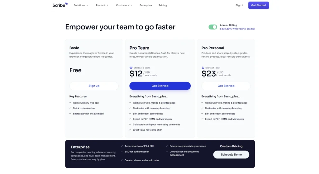
So I went on their website and clicked on their pricing page to see their plans. I then clicked on the Sign up button on the Basic free plan.
Then my product-led growth brain thought, wouldn’t it be a great idea to break down the tools’ onboarding and see how I experience it as a user? So here I am. P.S. I am going to be making a lot of these.
Disclaimer: I had no negative intentions when going through Scribe’s onboarding. I have made these posts for my own curiousity and for testing out my PLG skills.
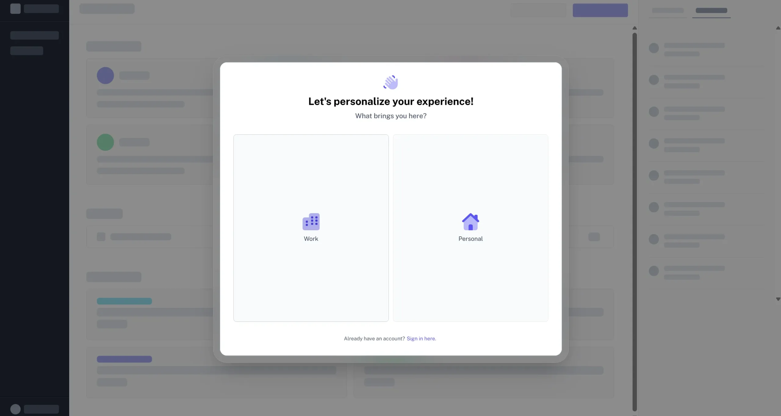
After clicking on the CTA, I was brought right into the tool. I was pretty happy about it because not all tools do that. Generally, tools first ask you to create an account by adding your email and password. Spoiler alert: I wasn’t brought into the real app.
The first screen asked me what brought me to Scribe. I clicked on Work.
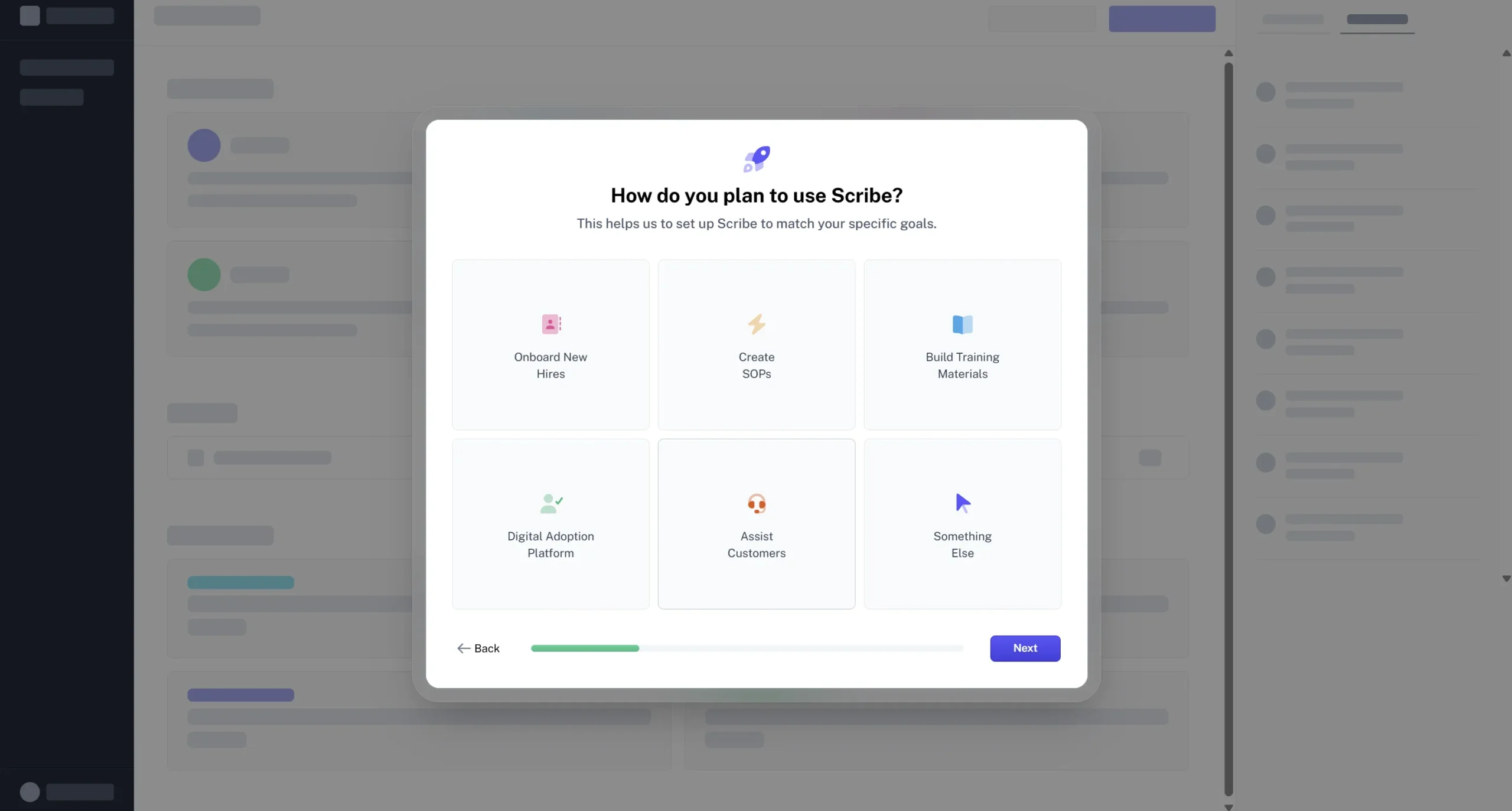
The next question was “How do you plan to use Scribe?”, and then there were different options like “Onboard new hires”, “Create SOPs”, and more. I clicked on “Create SOPs” and then on Next.
Questions like these can help personalize the user experience better. For example, you could show templates or guides related to each use case. It would be interesting to see how they do this later on.
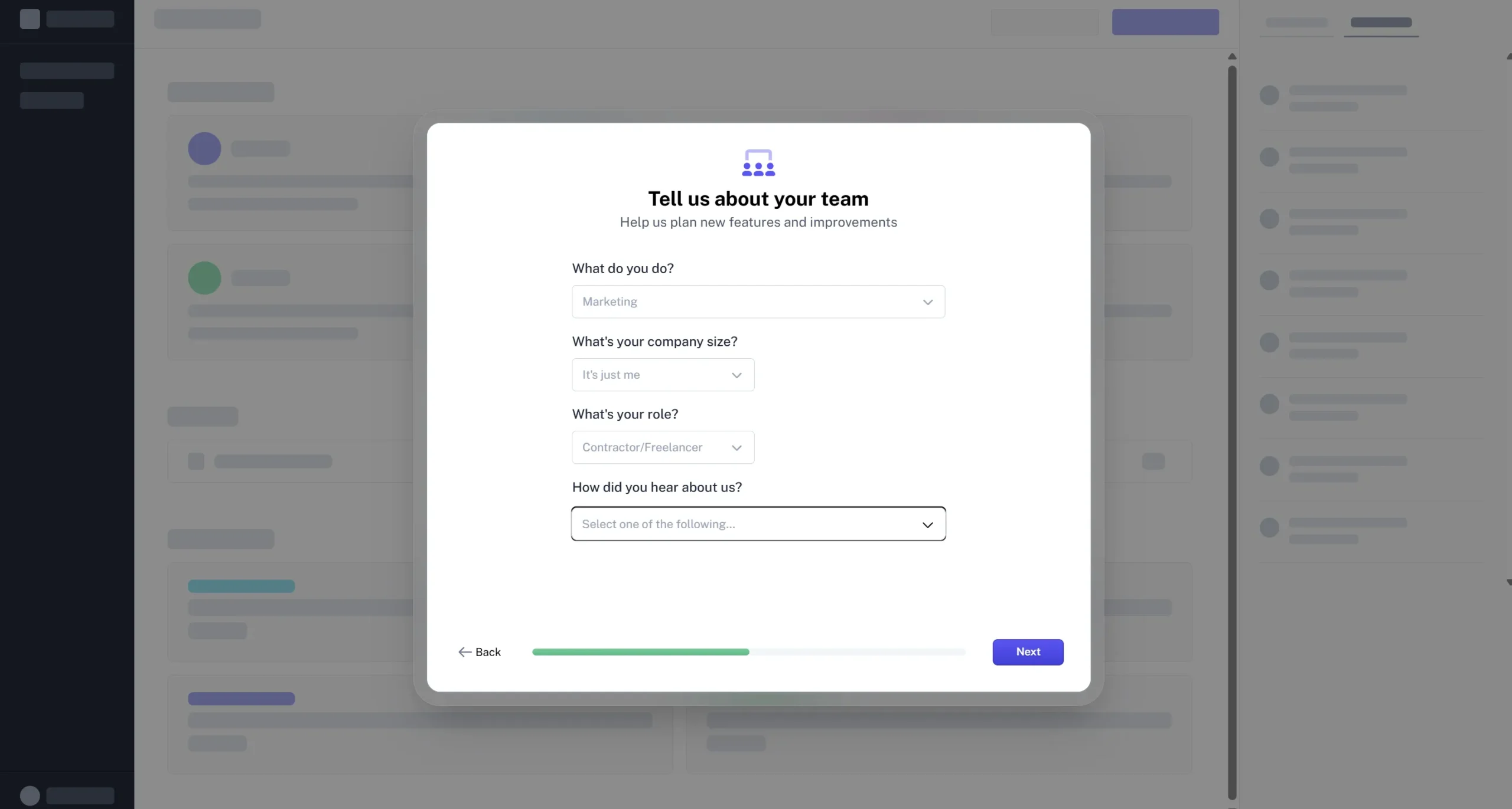
Next, it asked me about my team by asking questions like “What do you do?”, “What’s your company size?”, and others. Now I don’t really have a team, as it’s just me here at Packted. So I filled out Marketing, it’s just me, Creator/Freelancer, and Google.
Again, this is part of the personalization, and if implemented correctly, can be used to make the user’s experience better.
After these questions, they asked me to create an account by asking for my work email, name, and password.
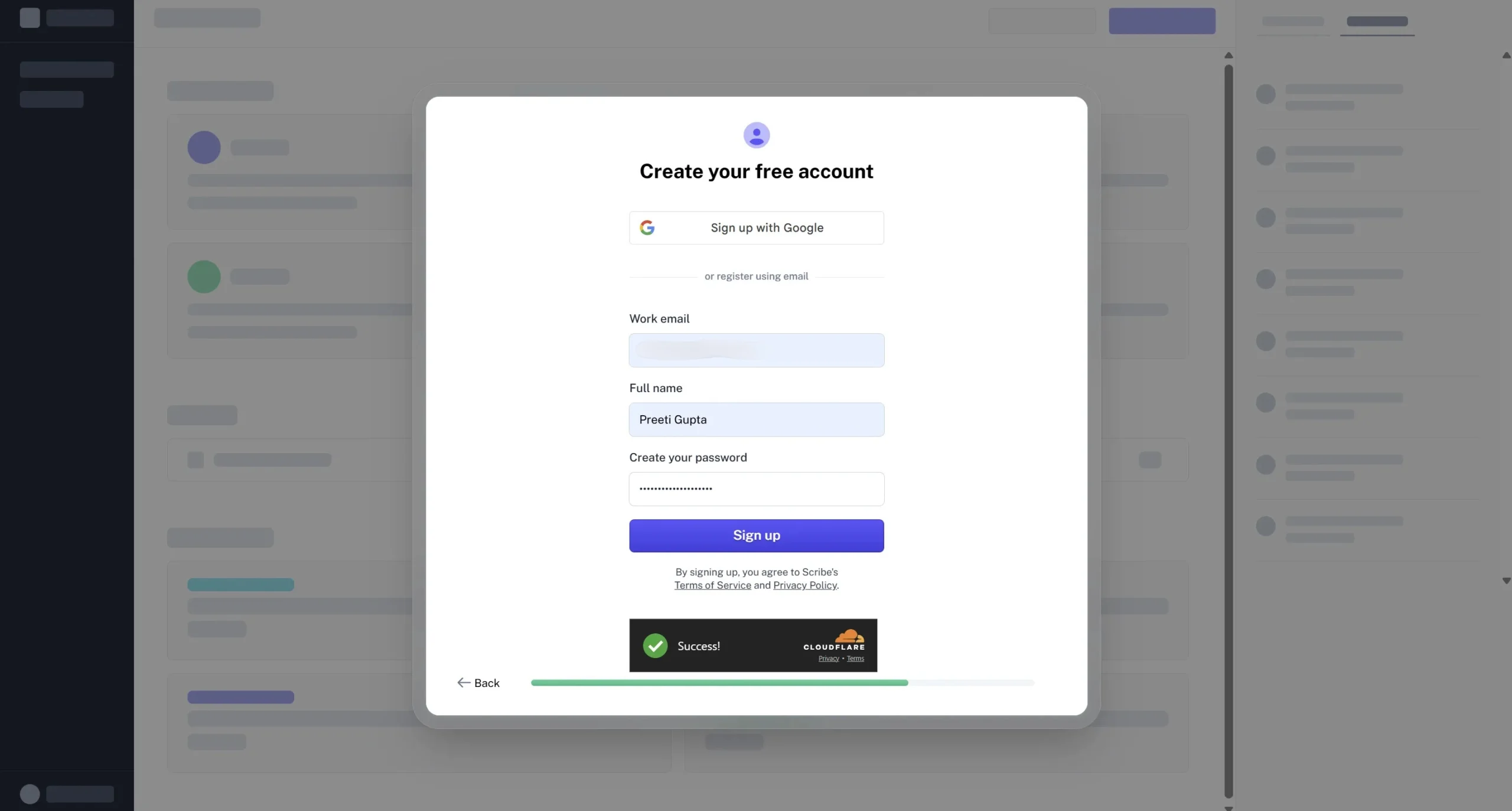
Everything was great up until this point. But then they asked me to verify my email.
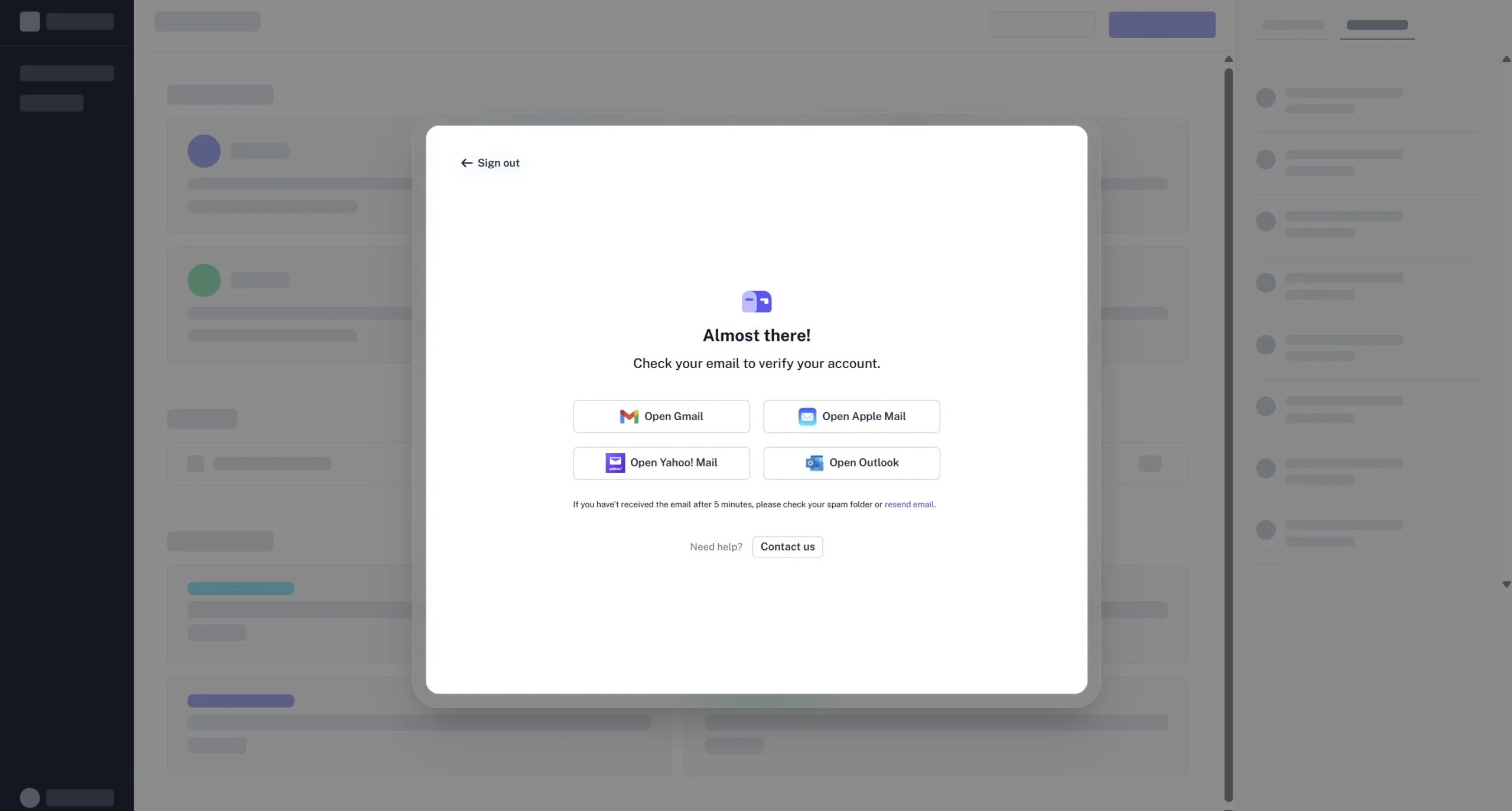
I don’t really have any problem with email verifications. They’re very common these days, but the thing is that they’re not done nicely. For example, let’s say someone clicked on “Open Gmail” from the screen above; they could tweak this URL by adding parameters that would find the email regardless of where it is- Spam, inbox, or anywhere else. Growth.design actually offers a great solution for this.
I do have to give them kudos for giving nudges to open different email providers like Gmail, Apple Mail, and others. Most of the time, apps show you a screen with the email verification text and nothing else.
Also, a lot of effort goes into confirming the email, which creates friction. Whenever you open your inbox, you have to search for the email, and in that process, you can get distracted. The worst part would be if the email landed in the spam folder.
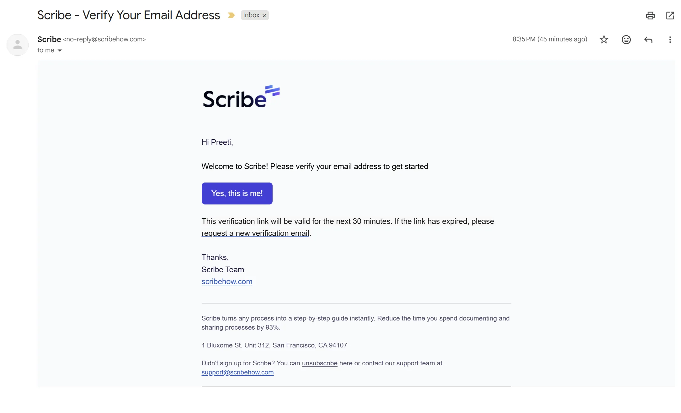
And this is what happened with me. I got their welcome email in my inbox, and their verification email in the spam folder.
P.S. I did the onboarding again to capture screenshots and used a Gmail address. When I did this for the first time, I was on Zoho with my work email.
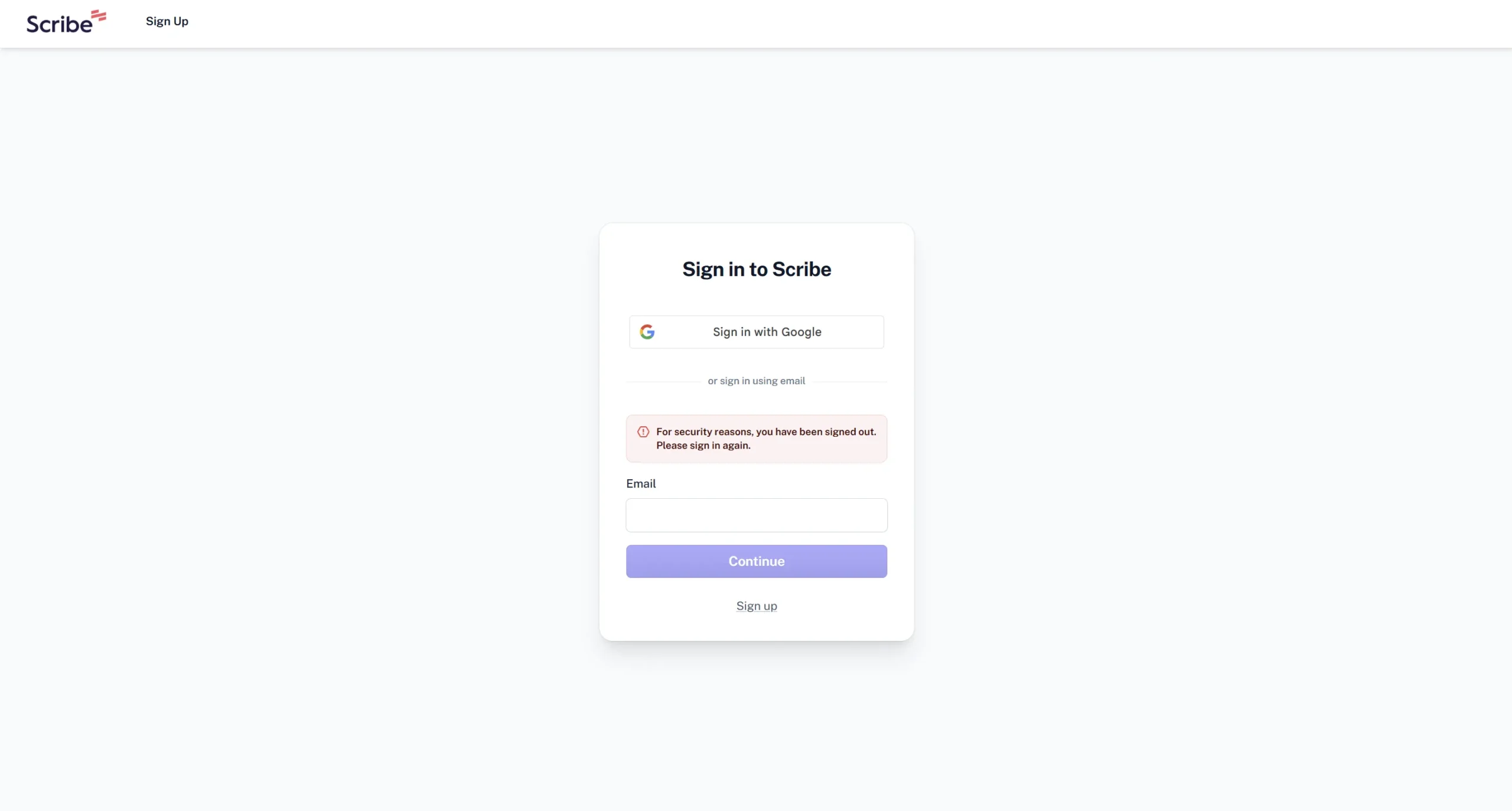
When I clicked the link, it asked me to sign in again “for security reasons”. This is not the best user experience because it, again, creates friction.
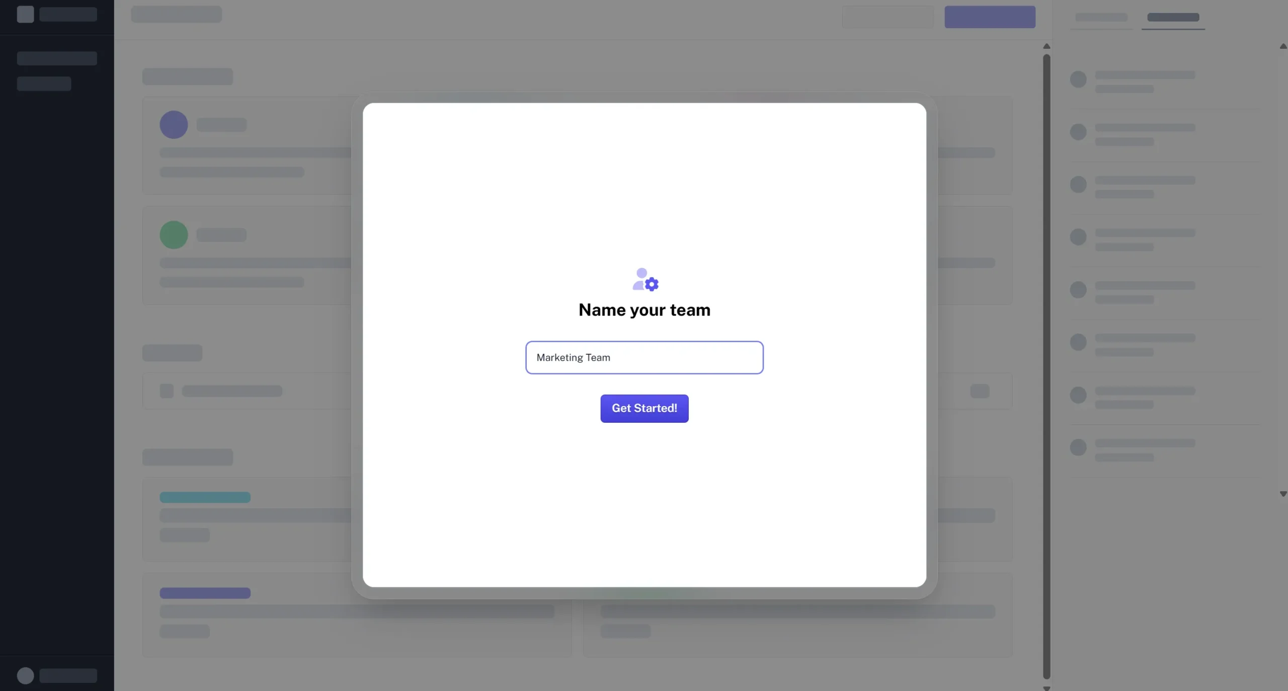
After logging in, it asks me to name my team. The default name was “Marketing Team”. I wrote in Packted and clicked on the Get Started button.
This could have been worded better because, as I told them before, I don’t have a team. Maybe it could be called workspace or something. That would be a better way of framing it.
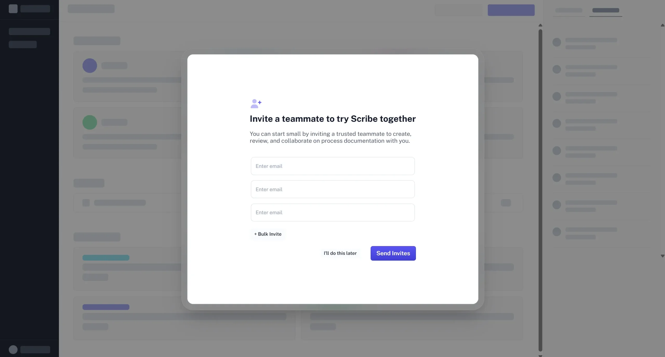
Next, it asked me to invite teammates and provided three fields for emails. I clicked the “I’ll do it later” button.
There are two problems here:
- The Call to Action (CTA) button on the last slide was “Get Started”. As a user, I assumed I could finally see the dashboard and create Scribes. Instead, I was presented with an inviting team prompt.
- The tool already knew that I didn’t have a team. It could have used that information to personalize my onboarding. It also doesn’t seem like a step that would get me closer to the “aha” moment.
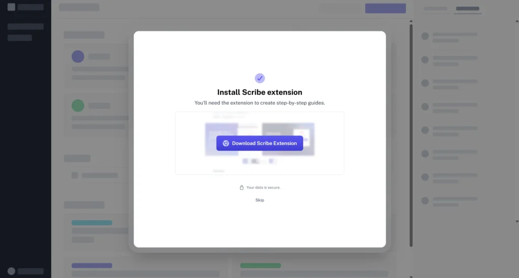
Next, it asked me to install the Scribe Chrome Extension.
This seems like an important step because users need the extension to capture Scribes. But at this point, users can become frustrated because they have been through a lengthy onboarding process. A better way to do this would be to remove all the unnecessary steps and introduce this slide early.
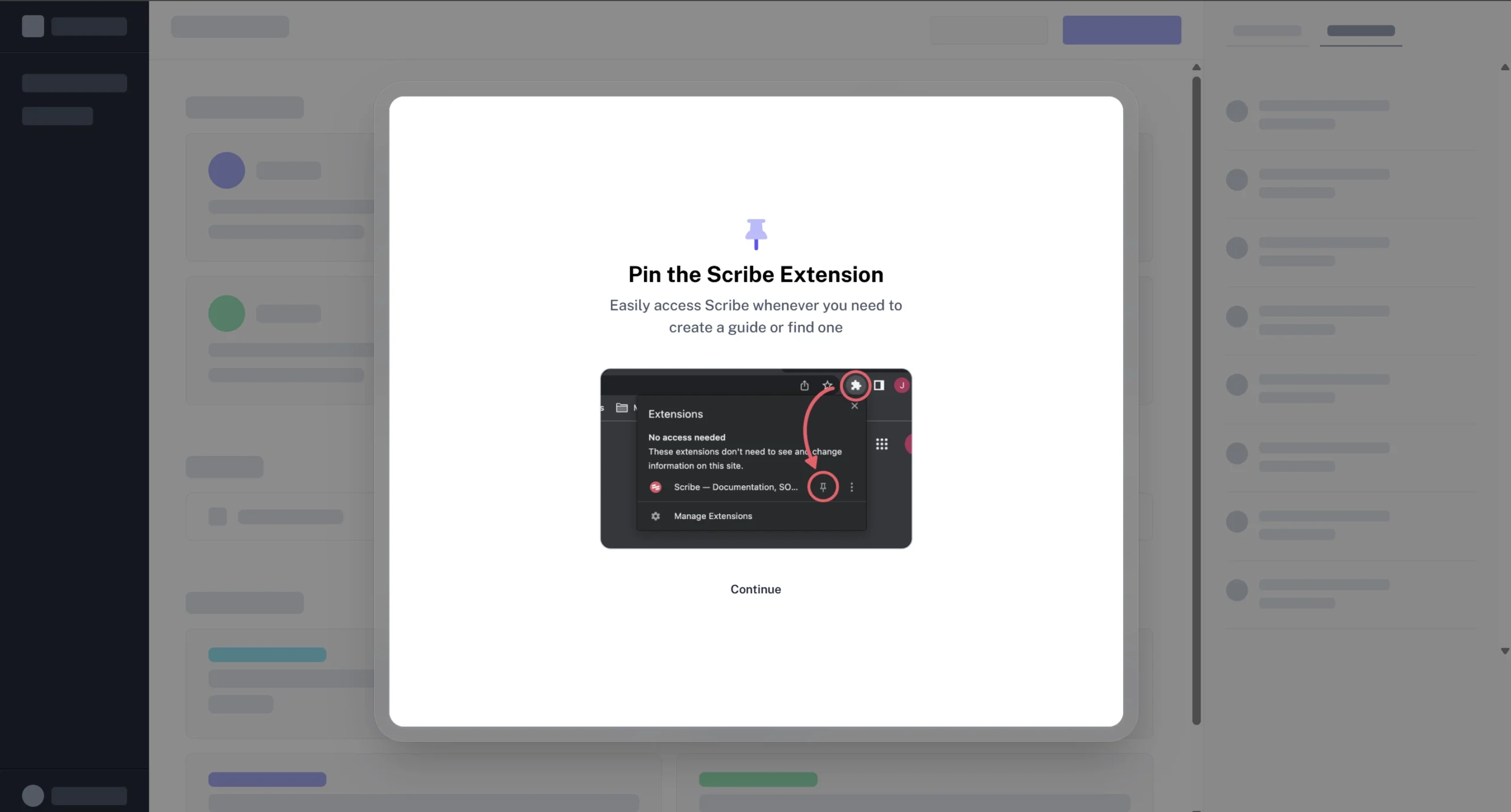
Another point to note is that during this onboarding, the user left the app twice: the first time verifying their email, and the second time installing the extension. Many distractions mean not everyone will complete the onboarding and take the desired action.
Anyways, I clicked the button and installed the extension. After that, it prompted me to pin the extension. I pinned the extension and clicked on Continue.
Again, I don’t know how helpful it is for the user to complete the key task of making a guide.
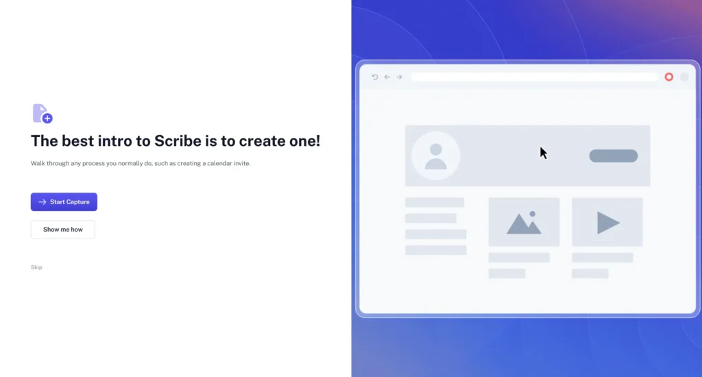
Next, it gave me this walkthrough of how to create a Scribe. I clicked on Show me how and then clicked on Done.
As a user, the onboarding feels really long, and it makes me frustrated because I am not able to go and use the tool.
Finally, after what felt like a million steps, I was in the dashboard.
I can see that they have a checklist for getting people to an aha moment, and right now I am at 40%. They also used the empty states nicely and had a clear action I needed to take: to create my first Scribe.
I might sound like I am repeating myself, but the one thing I didn’t like was that not everyone will have a teammate (like me), so one of the checklist items won’t make sense for users like us. I understand that this can help teams adopt the tool faster, but it might not help everyone.
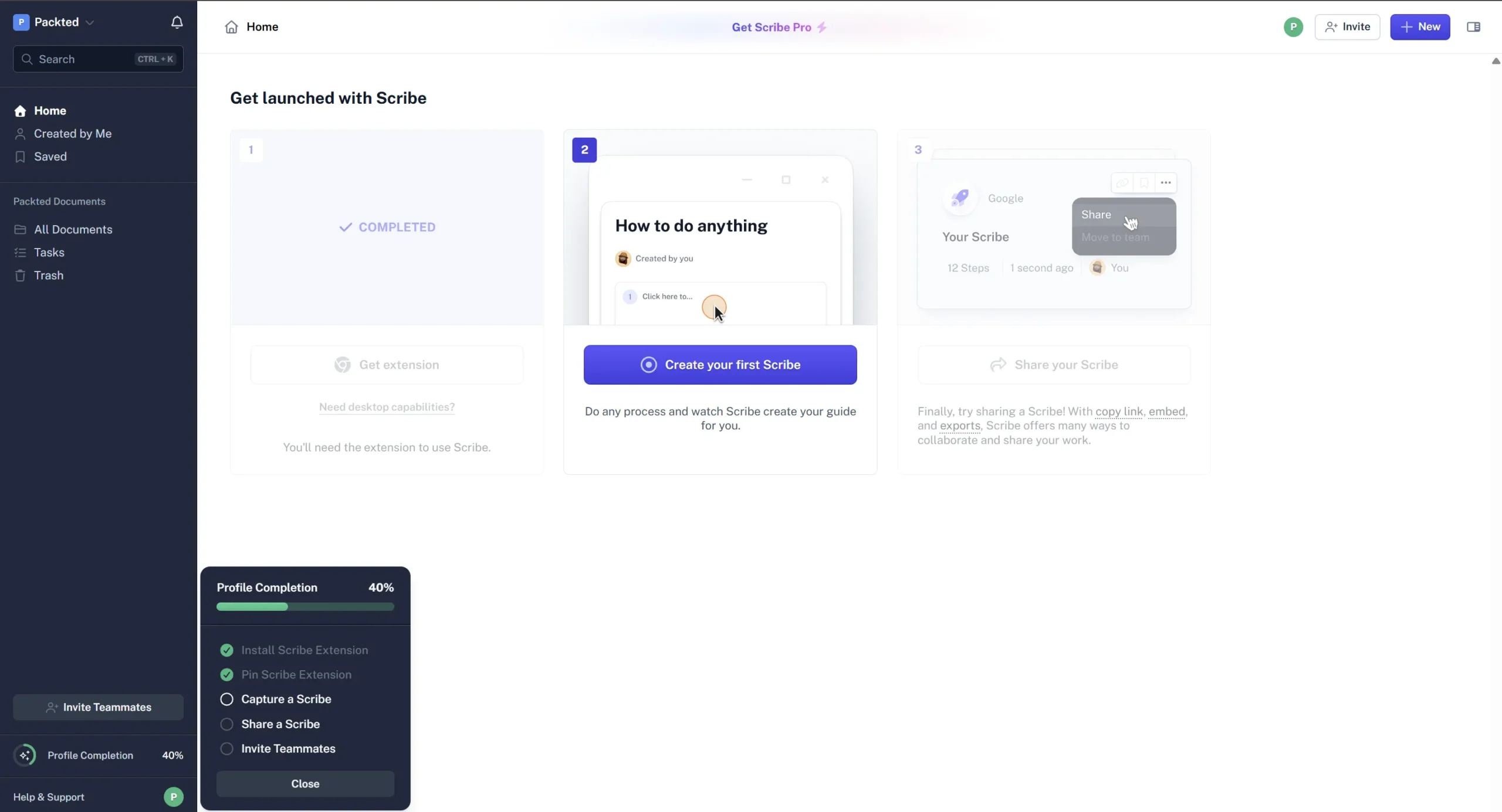
And with that, I created my first Scribe, and the user interface was clean, and the Scribe itself was helpful because I didn’t have to record everything or take multiple screenshots.
I plotted my emotions along each step on this graph. You can see the drop off happened when they asked for emails, and the verification email went to spam. The most significant drop occurred when they asked me to invite teammates. I don’t have any teammates, and the tool could have used the information to personalize my onboarding.
Here are a few fixes I would do to make sure the user reaches the aha moment faster:
- Do not ask for questions in the onboarding that won’t help the users reach the aha moment faster. Most of the things asked can be done/modified later in the dashboard.
- I know email verification is essential, but delaying it can help the drop-offs. You can ask users to verify their emails after they’re in the dashboard.
- Personalize the onboarding according to the users. If the user said they are alone, why add a step and ask for their team emails?
- Keep the onboarding short. This onboarding had 10-12 steps and can feel very long. Users don’t have such a long time to spend on the onboarding.
This is my interpretation of the app, and multiple factors go into designing the onboarding for your users. I analyzed the app through a regular user’s lens, and not all users are created the same. I hope this helped you understand how to make your onboarding better.
Let me know which app I should tear down next.
P.S. Growth.design inspired me to make posts like these. I have been watching their case studies where they teardown different apps, which taught me a lot about apps and how to make apps better for the users.
P.P.S. If you want me to go through your tool’s onboarding flow and suggest how it can be better, book a call or send a text.